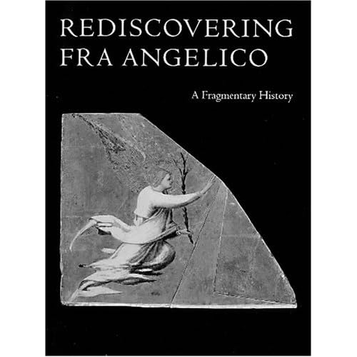
Rediscovering Fra Angelico: A Fragmentary History
Category: Books,Arts & Photography,History & Criticism
Rediscovering Fra Angelico: A Fragmentary History Details
Two fascinating essays reveal how art historians and conservators do their sleuthing. Laurence Kantor explores the attribution of three of his panels that had been at Yale but belong to a triptych at the Getty.

Reviews
Although, or perhaps because, it runs only 58 pages, this volume is a model of both scholarship and book production. Focused on a 2001 exhibition at Yale University Art Gallery celebrating restoration work on two panel fragments of the Annunciation in their collection by the early fifteenth century Florentine painter and cleric, Fra Angelico, it is a pleasure to hold and read. An essay by Laurence B. Kanter (then primarily at New York's Metropolitan Museum of Art and now Chief Curator at Yale) places the fragments within the context of Angelico's oeuvre (which he also helps the non-specialist reader understand has been an evolving one), while another by Carl Brandon Strehlke (of the Philadelphia Museum of Art) shares fascinating stories regarding the disassembly of multi-panel altarpieces and the subsequent growing interest in and collecting of them, particularly by Americans. Physically well composed using Bruce Roger's famed Centaur typeface (along with the Italic Warde designed for it), the gracious layout of the pages and the high quality of the color and black-and-white illustrations make it a pleasure to hold and read.


